
Table of Contents
“Aesthetic” started as a joke about how people describe their Pinterest boards and ended up a genuine category, a shorthand for a particular kind of warm, lived-in, slightly nostalgic image. Soft morning light through a window. A book left open with a cup beside it. String lights over a bed. It’s less about any single subject than about the mood the subject implies, which makes it an unusually good fit for coloring, because the mood is largely carried by the colours you pick.
There are 40 free designs in this collection, and around half are interiors. Beds beside windows and under string lights, a four-poster canopy bed, armchairs with blankets and stacked books, a fireplace with a chair pulled up to it, a living room crowded with houseplants, a nightstand with a lamp and candle, a vanity with perfume bottles, and an open closet of hanging clothes. Two desk scenes, one with a laptop and mug, one with a book and a plant, sit in the same register.
The food and drink pages are a small set of their own: coffee with a book and a pastry, toast and coffee on a table, a teapot and teacup laid out with cookies. Simple arrangements, and among the easiest pages here to finish in a sitting.
The rest look outward. A cottage with flowers along the path, a log cabin among pines, a treehouse with a wooden ladder, a house on the waterfront, a picnic under a tree, a river running through forest. Then the smaller nature studies, a peony in bloom, sunflowers in a vase, daisies in tall grass, two butterflies, a bird on a branch, a swan on still water, three seashells, plus a crescent moon with stars, a glowing lantern, an ornate iron gate, and a rose resting on an open book.
Detail is moderate throughout, which is deliberate. Nothing here is as dense as a mandala, and nothing is as plain as a children’s outline. These are pages for an unhurried hour.
Every one of these aesthetic coloring pages is free, prints on standard US letter paper, and needs no sign-up. Click any design below to open the full-size PDF.
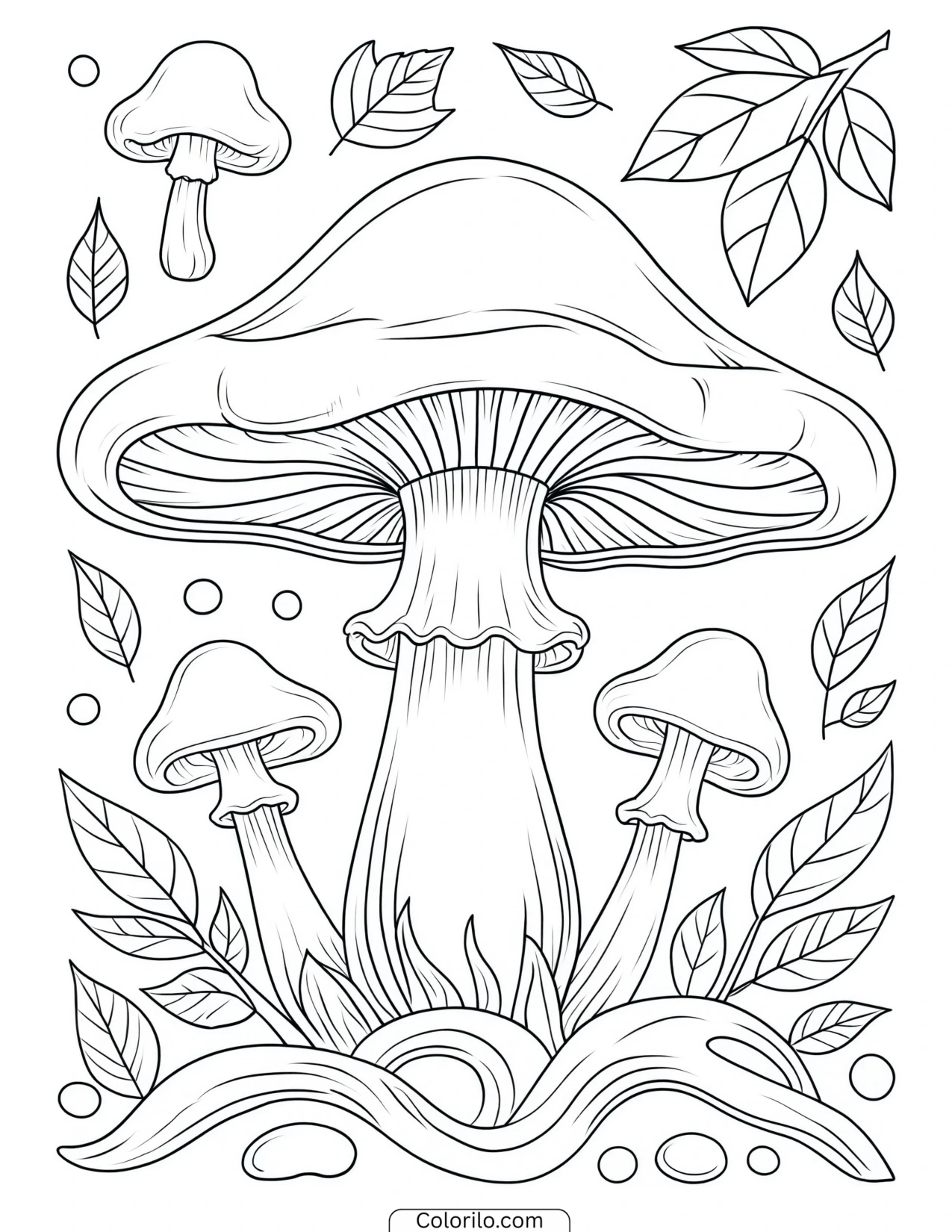
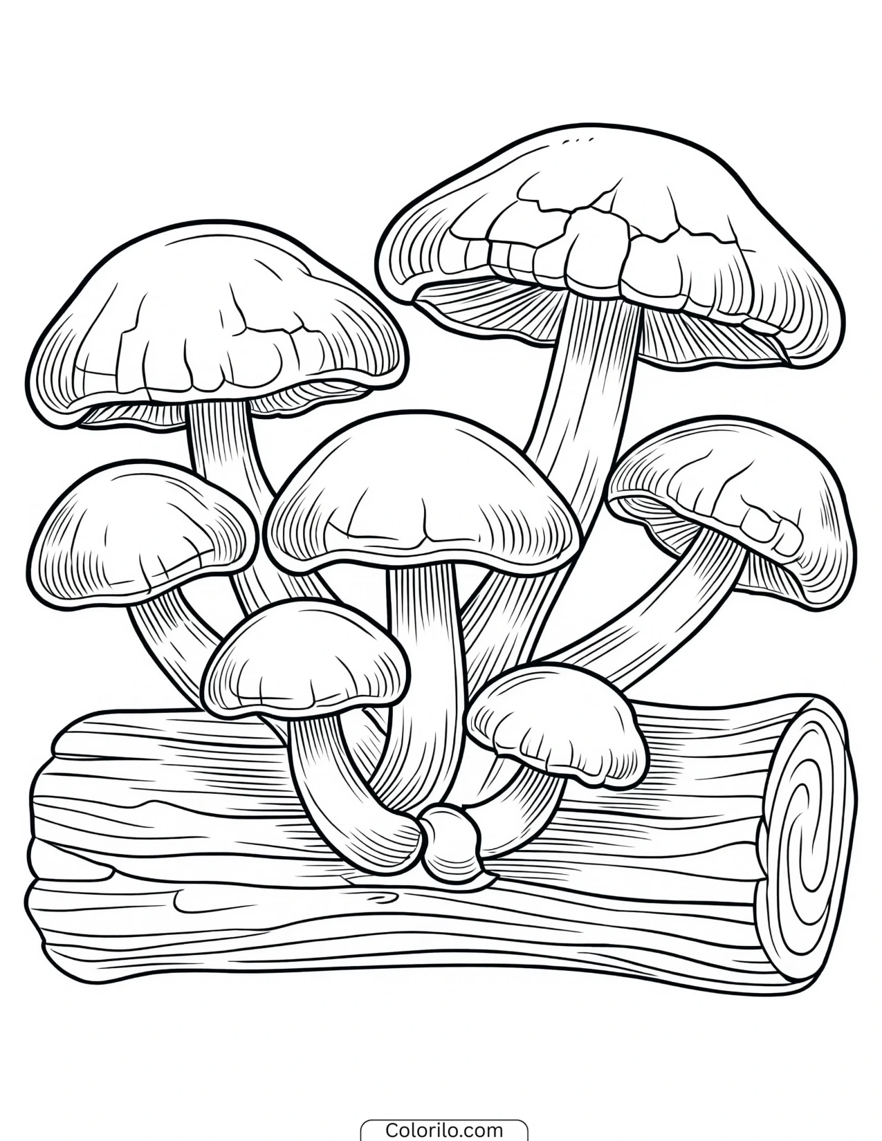
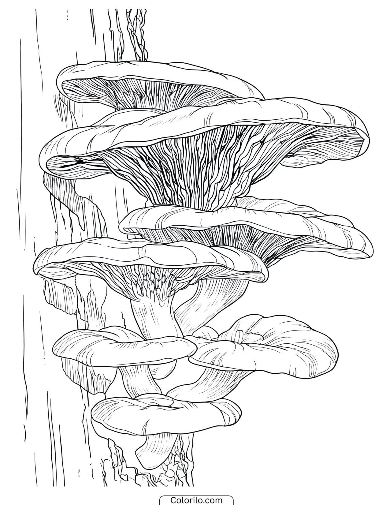
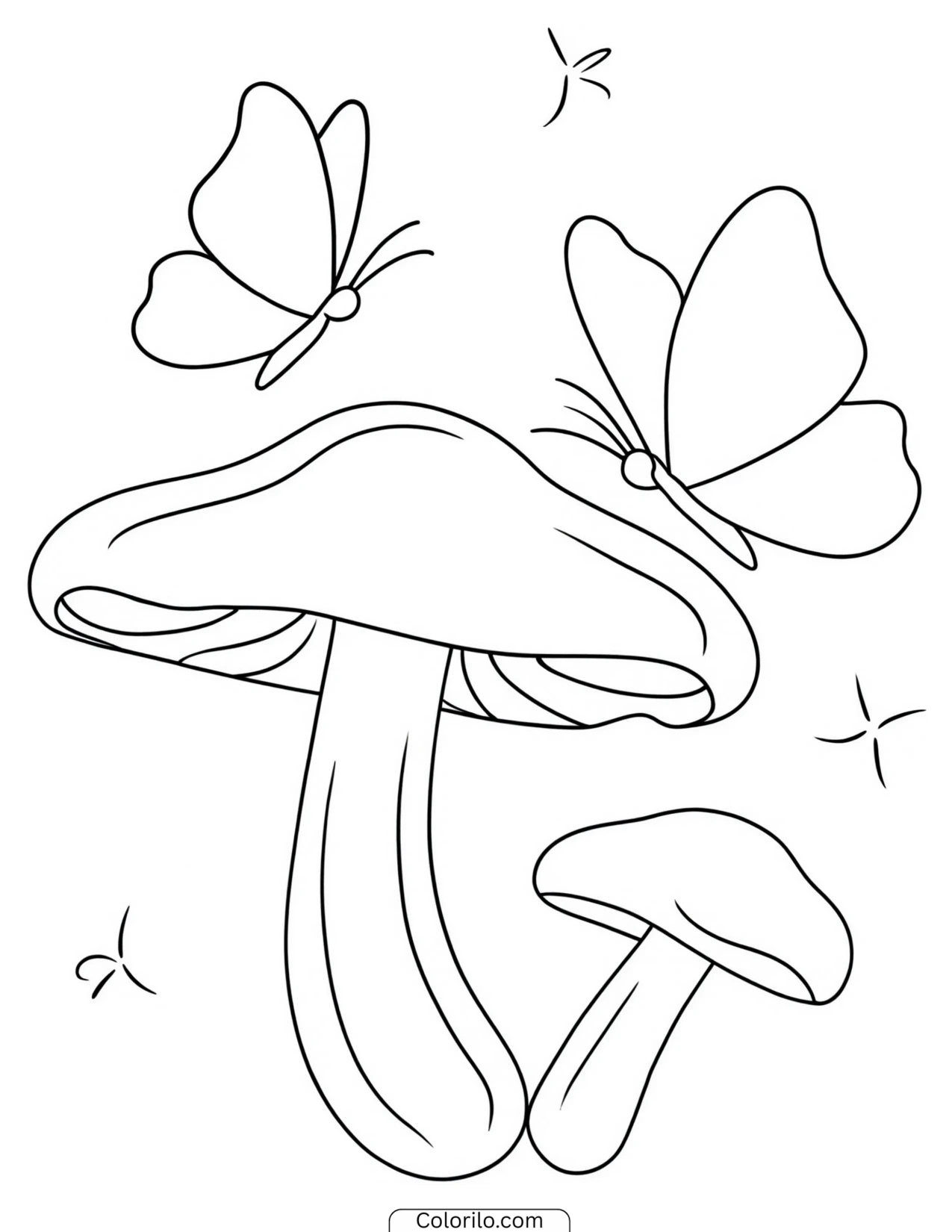
What’s in This Collection
Cozy interiors
Around eighteen designs. Beds, armchairs, fireplaces, desks, nightstands, a canopy bed, a vanity. These are the closest thing here to what people mean by the cottagecore and “cozy aesthetic” tags, and they’re the pages where warm colour choices do the most work.
Coffee and tea scenes
Three designs. The book-and-coffee arrangement is one of the most reproduced images in the whole aesthetic genre, and it’s worth noting why it reads the way it does: it implies a person just out of frame, and time set aside deliberately.
Cottages and cabins
Four designs, including a treehouse and a waterfront house. Small dwellings in landscapes, which is a visual idea with a long history, the picturesque cottage was already a fashionable subject in English painting by the late 1700s.
Botanical studies
Six designs: a peony, sunflowers in a vase, daisies in grass, a rose on a book, mixed botanicals, and a window framed by climbing roses. Simpler than a dedicated botanical set, and built to sit within a scene rather than stand alone.
Small animals
Four designs. A bird on a branch, two butterflies on flowers, a swan on water, and seashells. Quiet subjects rather than wildlife studies.
Light and night
Three designs. A crescent moon with stars, a glowing lantern among leaves, string lights over a bed. All three depend on the same trick when coloring: the light source works only if you leave it paler than everything around it.
Coloring Tips
Pick a palette and stay in it. This is the single thing that makes an aesthetic page look intentional. Four or five colours, say muted sage, cream, dusty rose, warm brown, used across the whole page will read far better than fifteen colours used once each. The genre is defined by restraint more than by any particular hue.
Muted beats bright here. Straight-from-the-box primaries fight the mood. If you only have bright pencils, laying down a very light layer instead of pressing hard mutes them considerably.
Leave the light sources alone. The lantern, the candle, the fireplace, the string lights, the lamps. Colour everything around them and leave the light itself nearly white, warming only at the edges. Filling in a lamp kills the whole page.
Warm indoors, cool outdoors. A simple rule that works: interiors read cozier with yellows, ambers and warm browns; the forest, river and waterfront pages read calmer with blues and greens. The cottage and treehouse pages can go either way depending on whether you want morning or evening.
Wood is not one brown. The armchairs, desks, cabin, treehouse and gate all involve wood or iron. Two tones with the darker one in the shadowed joints does more than any single colour.
Try the same interior twice. Print the bed-beside-window page once in warm morning tones and once in cool blues as night. Same lines, entirely different room, and a genuinely useful lesson in how much of atmosphere is colour rather than drawing.
Frequently Asked Questions
Are these aesthetic coloring pages really free?
Yes, all 40 are free to download and print. Click any design to open the PDF. No account, no email, no payment.
Who are these suitable for?
Mostly teenagers and adults. The subjects, interiors, coffee scenes, botanicals, and the level of detail are aimed at that audience rather than young children. The simpler pages, like the seashells, the moon and stars, and the sunflowers in a vase, work fine for children around eight and up.
What does “aesthetic” mean in this context?
It’s an informal category rather than a defined style, used across Pinterest, Tumblr and TikTok to describe images with a consistent, deliberately curated mood. In practice it usually means soft light, warm neutral palettes, cozy interiors, plants, books and coffee, which is what this collection covers. Related tags you’ll see include cottagecore, dark academia and slow living.
Can I use these for journals or wall art?
Yes, for personal use. Several work well as framed pieces once coloured, and the smaller studies, the seashells, the moon, the botanicals, fit neatly into a bullet journal or scrapbook. Free for personal, educational, and classroom use, not for resale.
Can I print more than one copy?
As many as you like. The interior pages in particular are worth doing twice in different palettes.
Why is this style of coloring so popular right now?
Partly because it sits at the intersection of two things that grew at once: adult coloring, which became a mainstream hobby in the mid-2010s, and the visual language of image-sharing platforms, where a consistent palette and a calm domestic subject perform unusually well. The appeal seems to be that these scenes depict rest rather than activity, an empty armchair with a blanket over it is a picture of nothing happening, which is precisely the point.
Leave a Reply